Studija Vibe
A portfolio site for a graphic designer, where the web design itself becomes part of her creative identity.
Web design / Development / UX / Animations / Interactions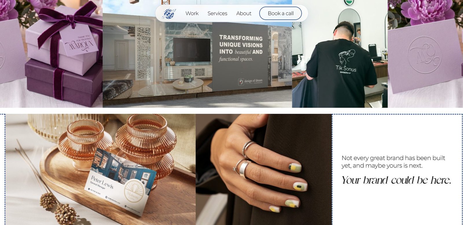
Not just the work, but
the creative character
In redesigning the Studija Vibe website, the goal was not only to present the designer’s work professionally, but to build a digital experience that conveys her creativity, her care for detail and her distinctive visual style from the very first moment.
An animation that draws you in,
and a problem you recognise
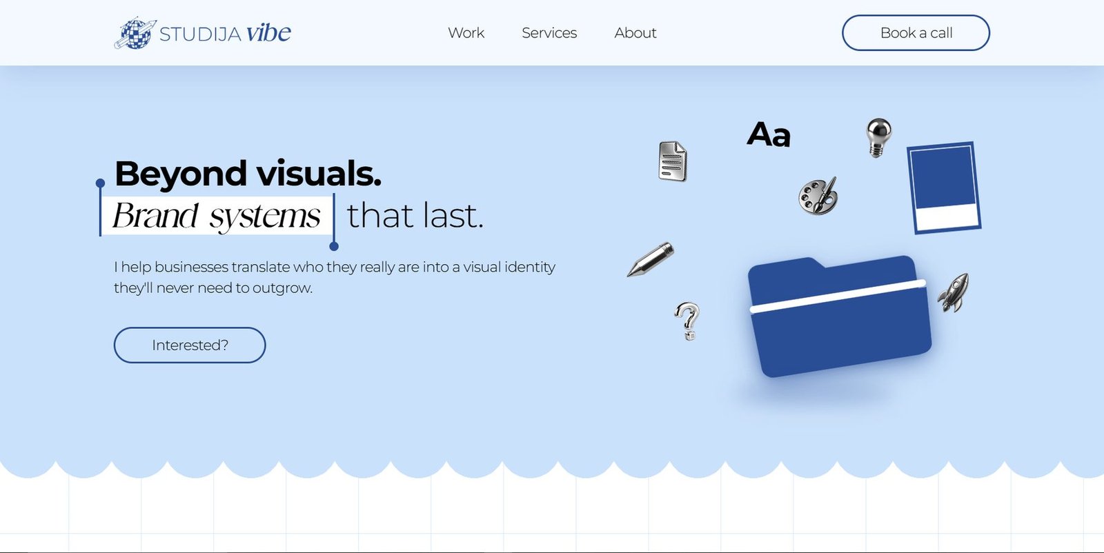
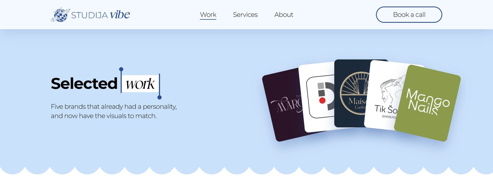
The star of the hero section is an interactive animation that catches the eye straight away and introduces the core idea of the brand. The site is full of bespoke graphics, subtle animation and macOS-inspired details that make the information not just easy to follow, but playful.
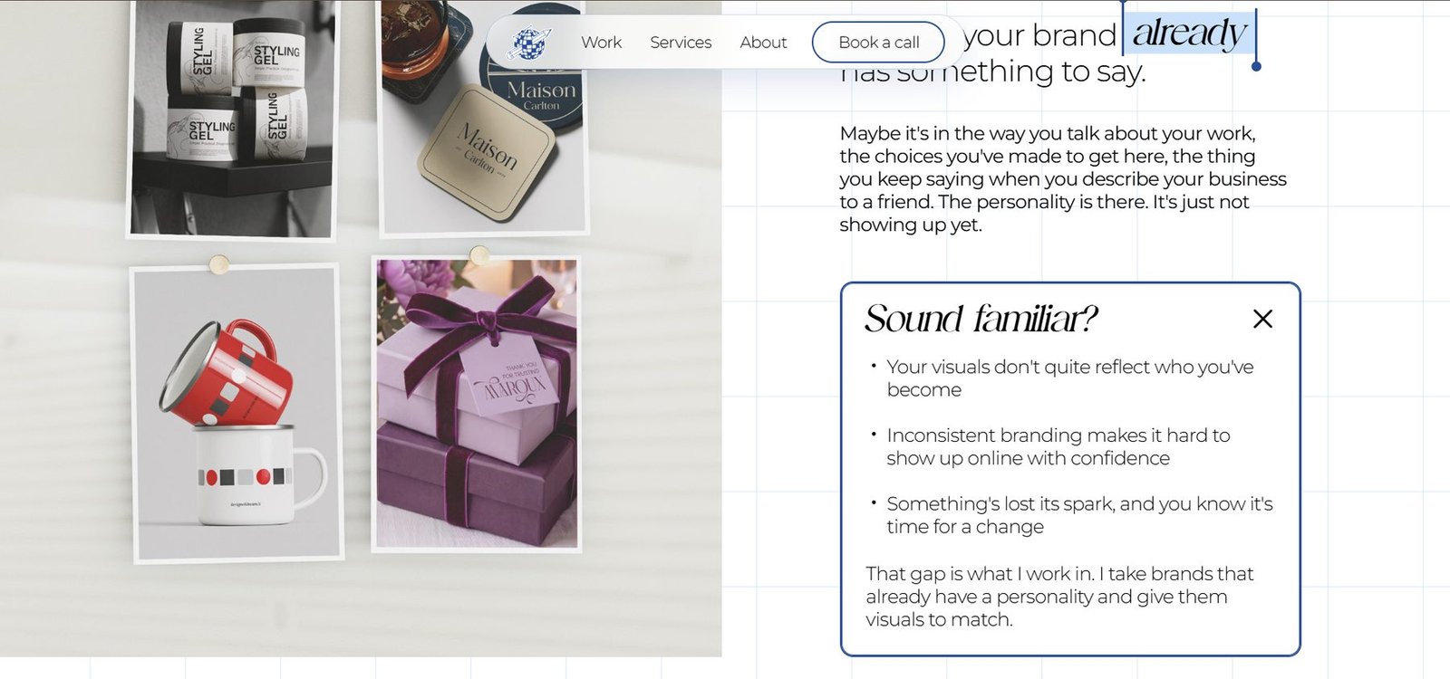
Right after the hero, the visitor meets problems they already know – visual inconsistency, a dated identity, a brand that no longer reflects the business. It lets people work out quickly whether this service is for them, and once they recognise themselves, they have a reason to keep exploring.

A clear path
to the service
Next comes the three-step process, laid out simply and visually, so that how the collaboration will run is clear before anyone gets in touch.
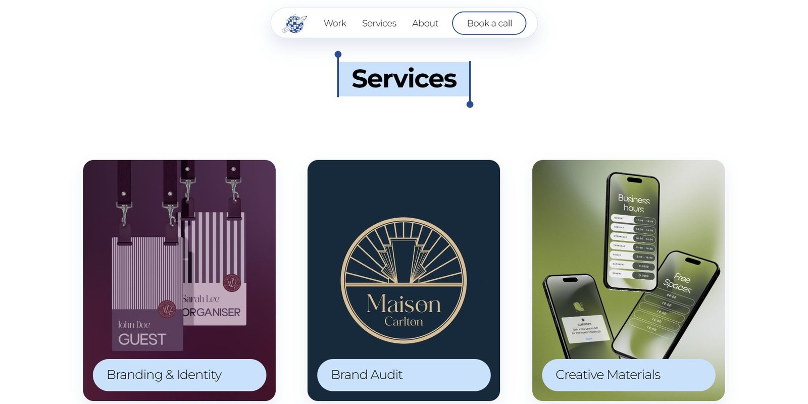
An interactive carousel lets visitors skim through different projects and move on to the fuller case studies. The services block shows the core competencies right away, and the client testimonials that follow act as one more piece of proof.
The work is
the main argument
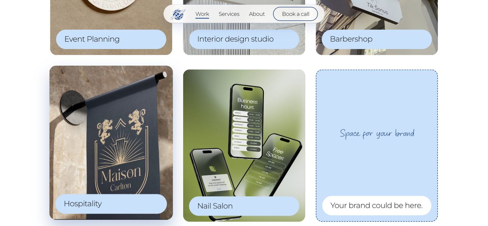
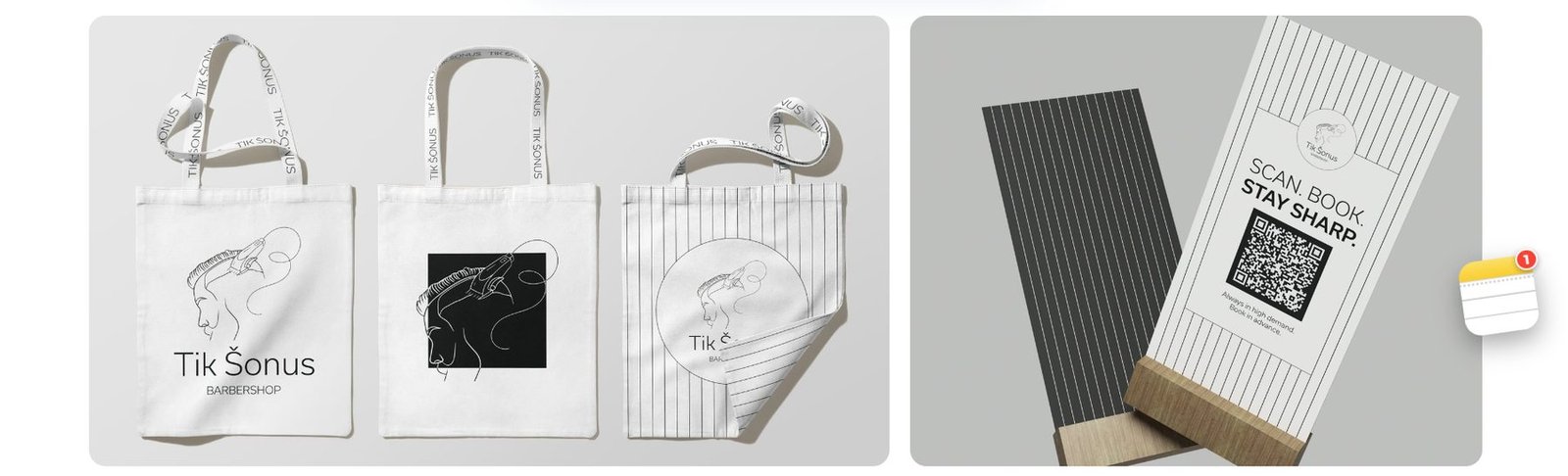
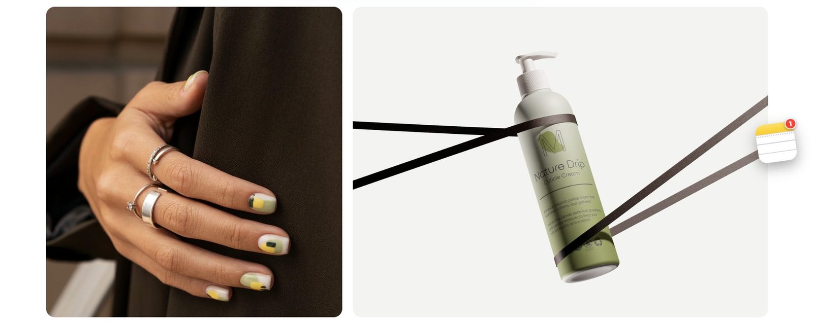
We kept the Work page deliberately minimal. It needs no extra decoration – the attention belongs to the designer’s work itself.
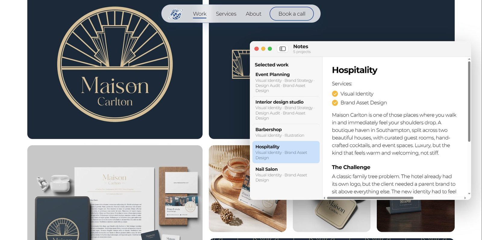
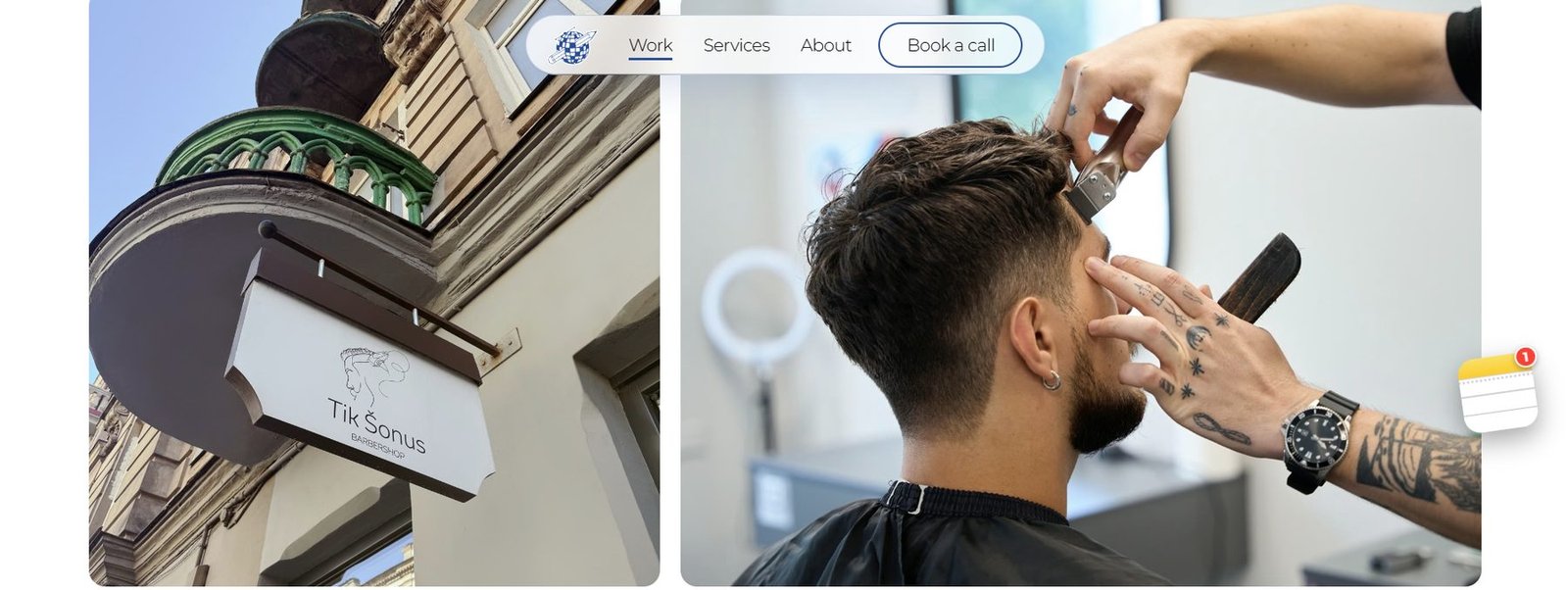
Projects are shown large, and a clear grid keeps order and makes the content easy to follow. Every project gets room of its own, so high-quality visuals are never squeezed into standard portfolio cards.
One of the most playful touches is navigation inspired by macOS Notes, which shows every project in one place and switches between them instantly. Nobody has to go back to the list and take extra steps.
Less noise,
more clarity
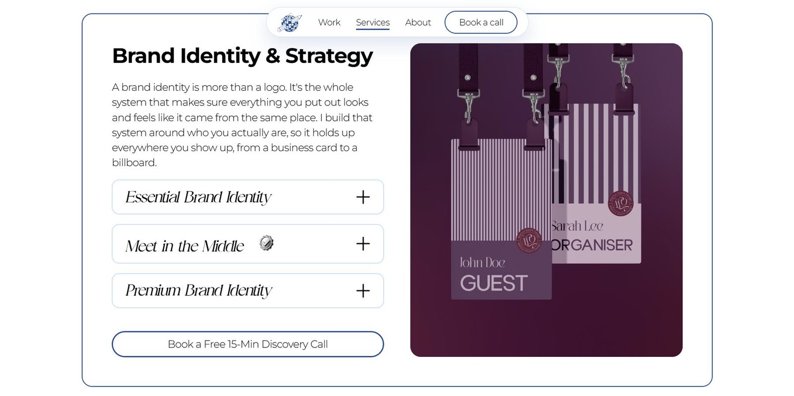
The job of the services page is to stop anyone getting lost in a large amount of information.
The services are split into clear categories and packages. A visitor can quickly pick out what they need, what will be delivered, how long it will take and what it will cost – and book a short call the moment they are interested.
The person
behind the work
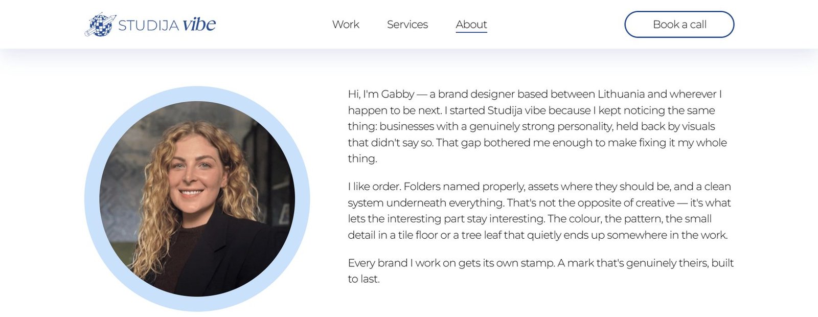
In creative services a client chooses not only a portfolio but a person, so the About page introduces the designer herself, her thinking and the principles she works by.
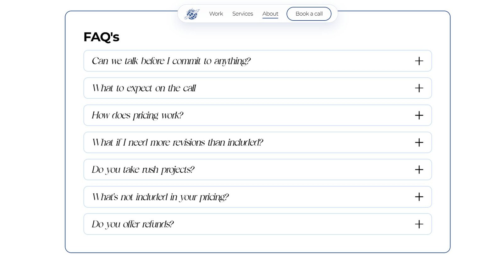
An FAQ sits right there, answering the usual doubts before ordering – from pricing and revisions to what the first call looks like.
Sticky navigation stays within reach for the whole journey, so once a visitor has gathered enough information and confidence they never have to hunt for the next step – “Book a call” is always one click away.
The details that
create the character
One visual system holds the whole site together: a light blue, thin grid lines, the contrast between serif and sans-serif type, bespoke graphics, animation and macOS-inspired UI elements.
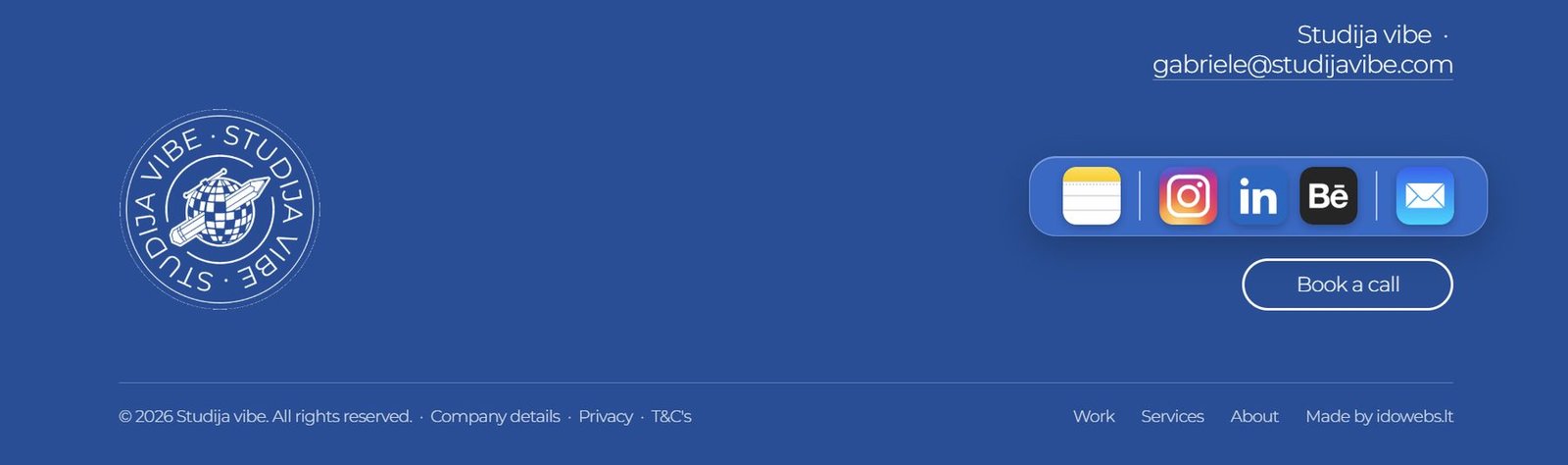
Even the footer is more than the technical end of a page – it carries an Apple/macOS-style social bar, the contacts, the “Book a call” CTA and a moving Studija Vibe mark.
A site that is the designer’s calling card in itself
The result is a site where the web design becomes part of the designer’s creative identity. Every page has a clear job: the hero makes the impression, Work supplies the proof, Services brings clarity and About brings the person. Together they show not only what Studija Vibe does, but how it works: in order, with thought, and with character.