Greta Volungevičiūtė
A minimal digital space built to reveal a designer's work.
Web design / Web developmentWork itself
becomes the navigation
The homepage had a threefold task: create an animation that draws the eye, show the work, and avoid overloading the visitor with information. Instead of making the animation a backdrop and the work a separate section, we made them one element.
We built a 3D perspective carousel in which the projects themselves move. Cards face straight on in the centre and turn away at the edges, so the gallery appears to continue beyond the screen. Hovering reveals the project name. The carousel responds to dragging, swiping, scrolling and the wheel, and carries on with inertia once released – the page is never static for a second.
There is almost no text: just the name, three navigation items and a footer. A portfolio visitor comes to see the work, not to read about it. The dark, almost black background lets Greta's colourful work look brighter without competing with it.
A list you
you never have to leave
In the work section every project is placed at the centre of attention. The background is light and the look minimal – after the dark homepage the work moves into white space where nothing competes with it. Projects are numbered and set alternately left and right so the list never becomes a uniform band.
We added a preview layer so a project need not be opened just to see what is inside it. Hovering, or tapping the plus, reveals a short description and a few extra frames – the whole portfolio can be browsed without leaving the list.
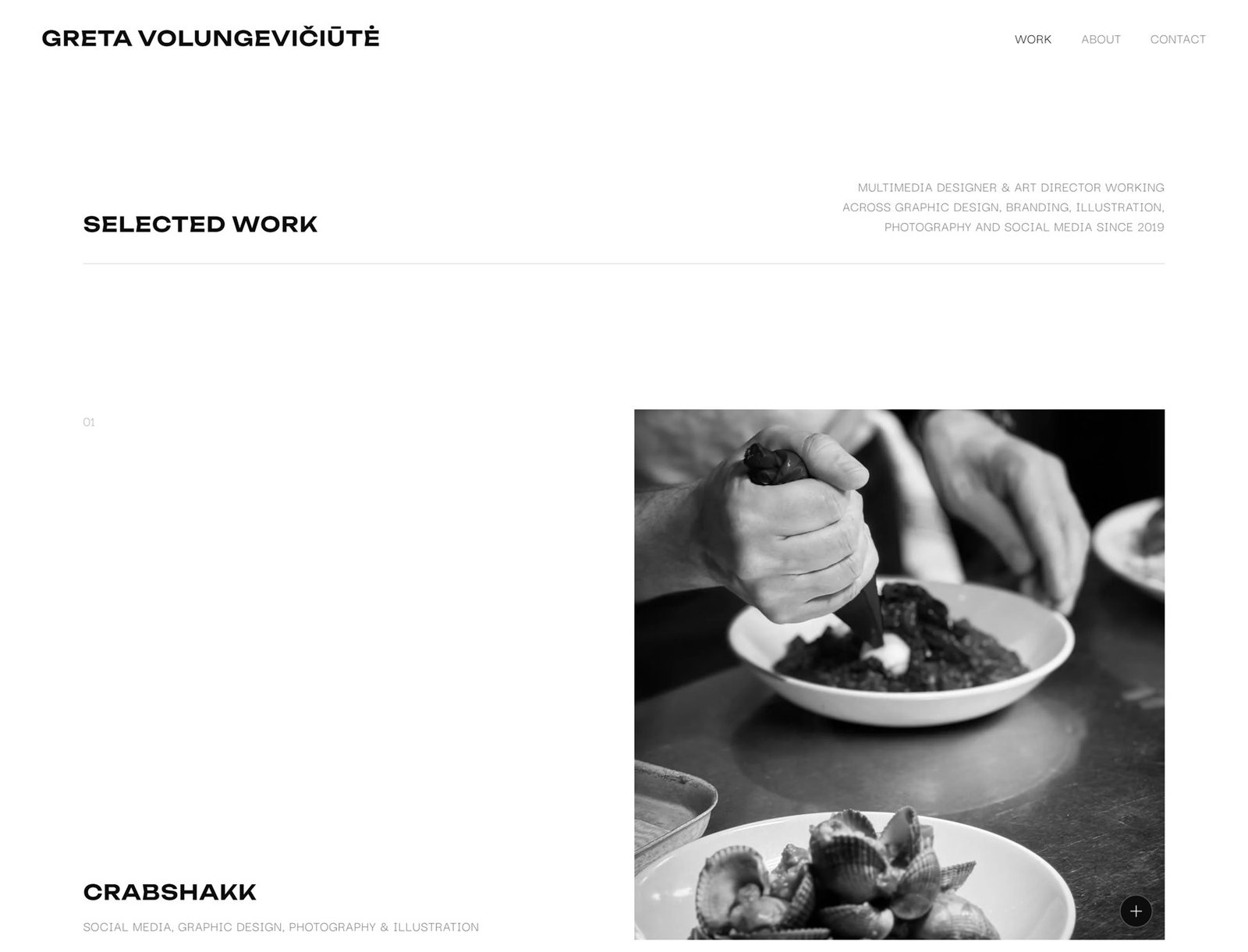
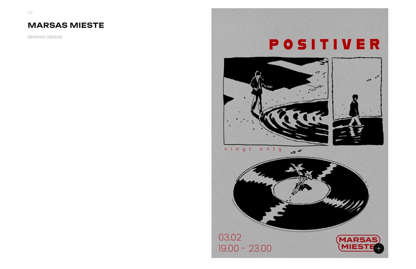
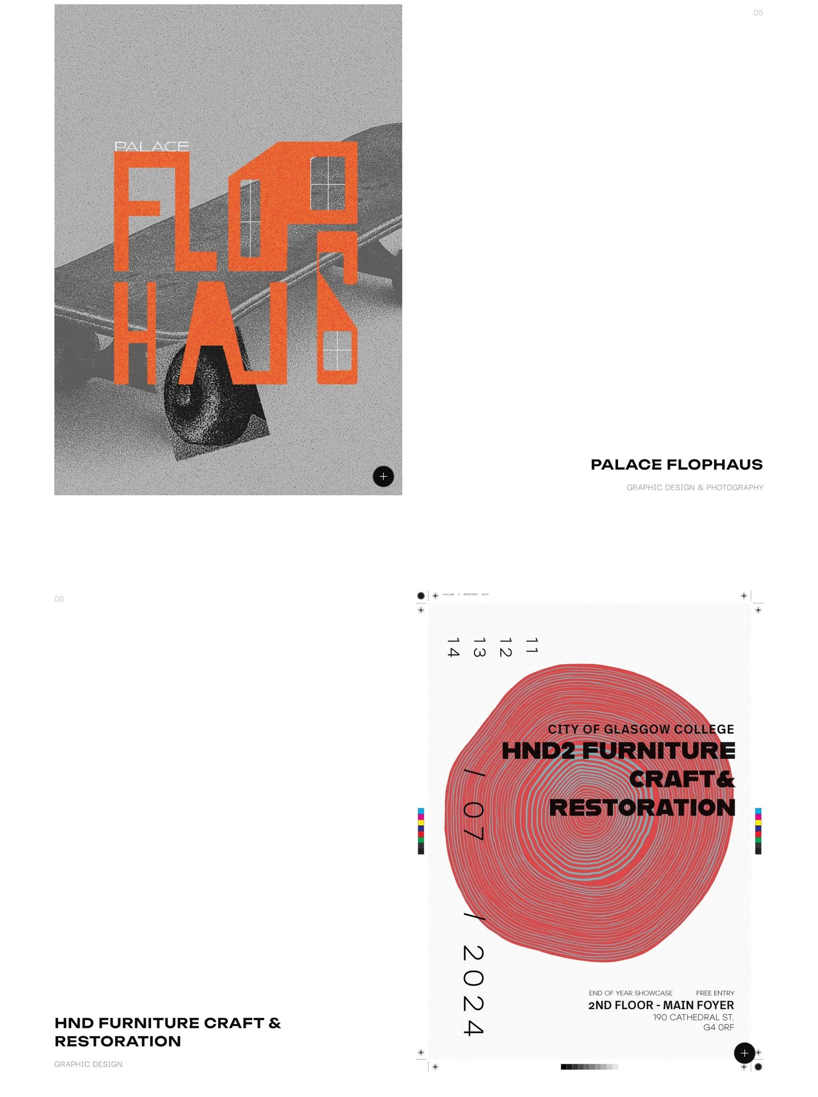
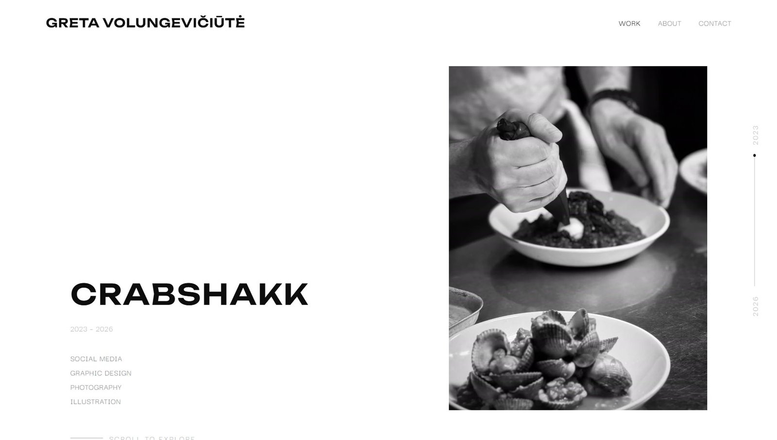
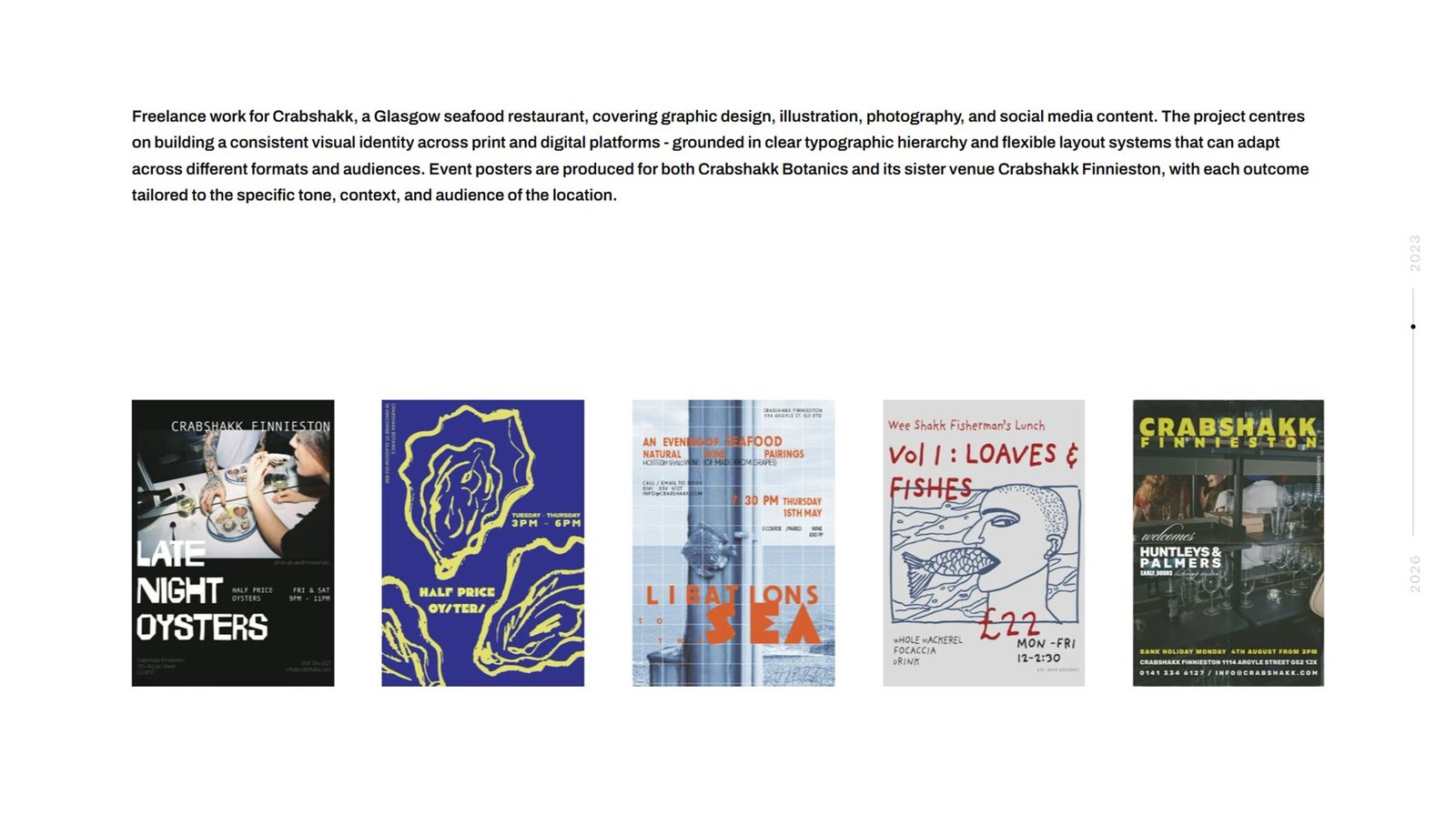
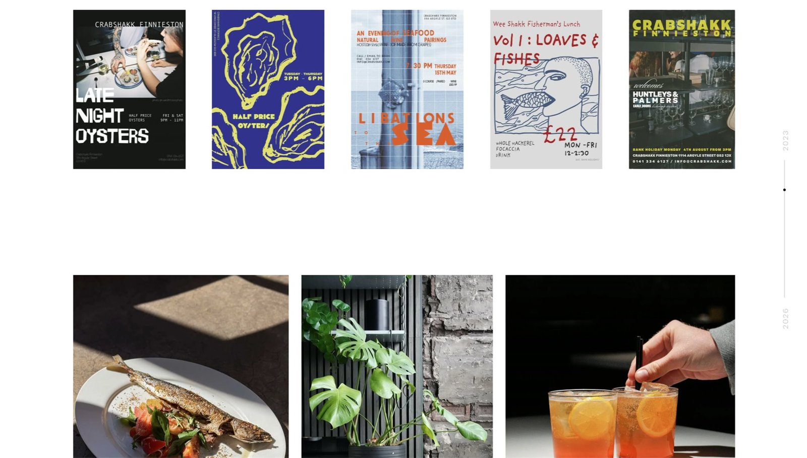
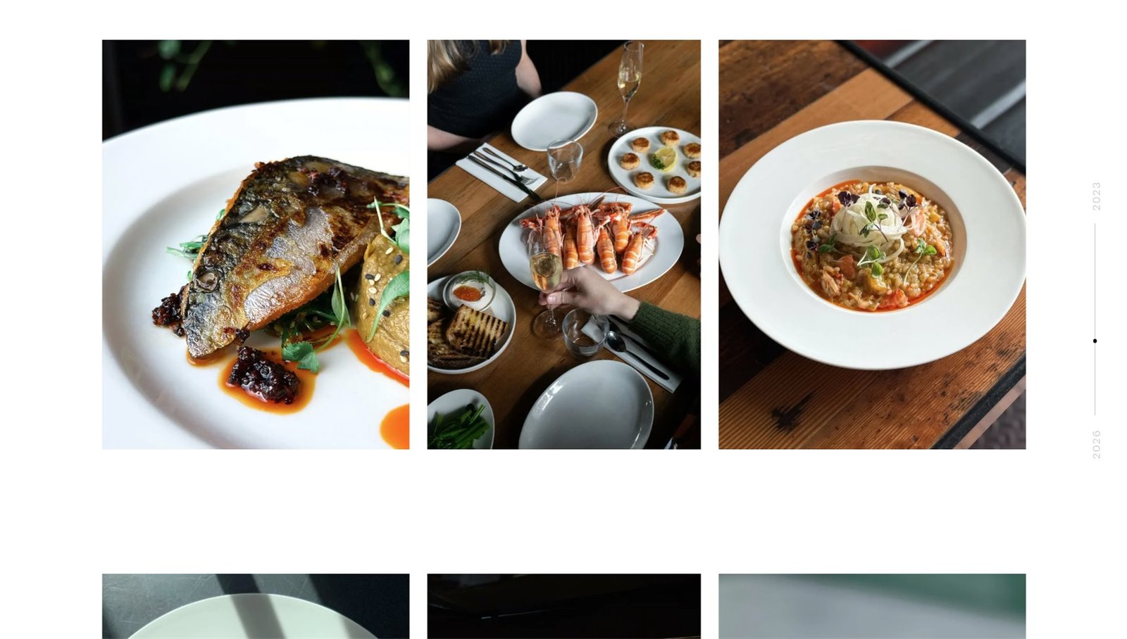
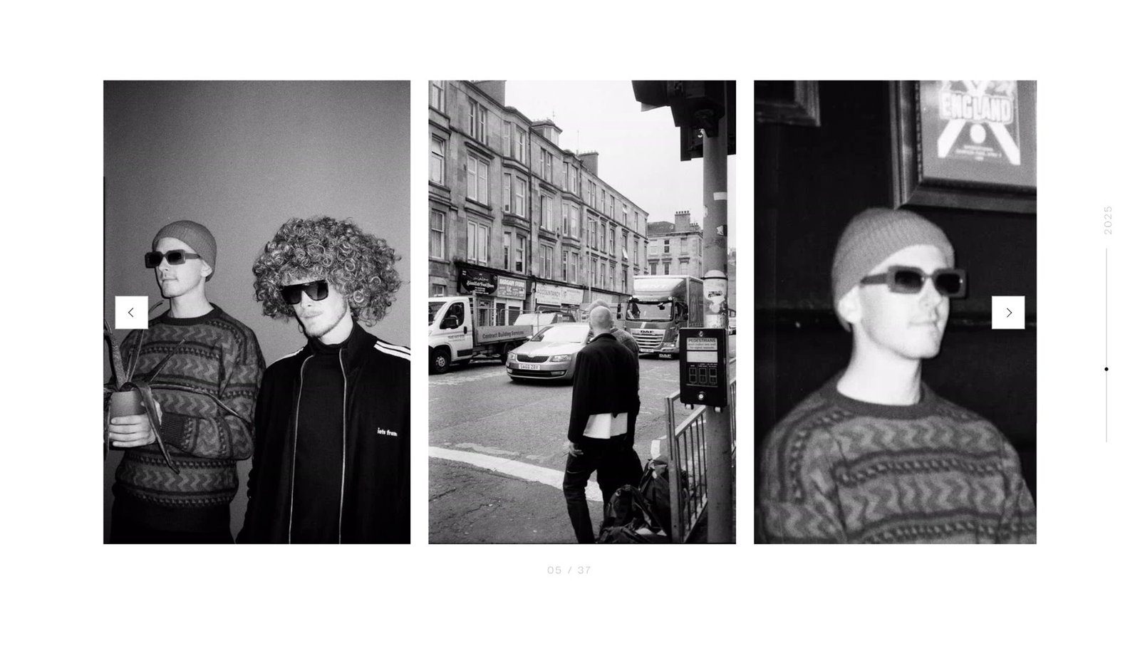
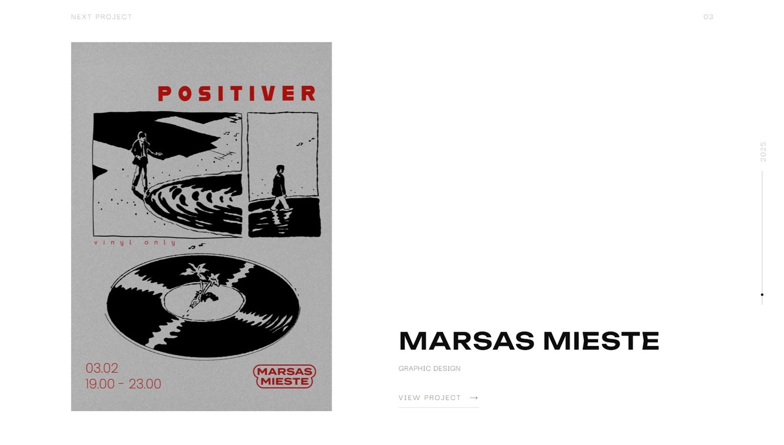
Opening a project reveals its name, the period and the disciplines, and below them the description, posters and photography. On the right a year rail moves along, showing how long the collaboration ran. At the foot of the page there is no button but a preview of the next project, so there is no need to return to the list: the work is joined into one continuous chain.
The number catches the eye,
the text explains
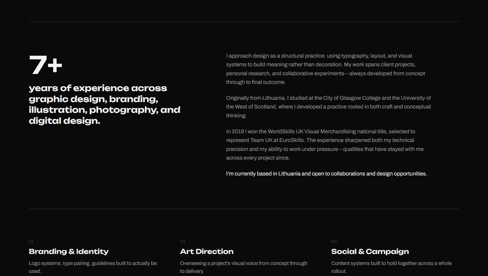
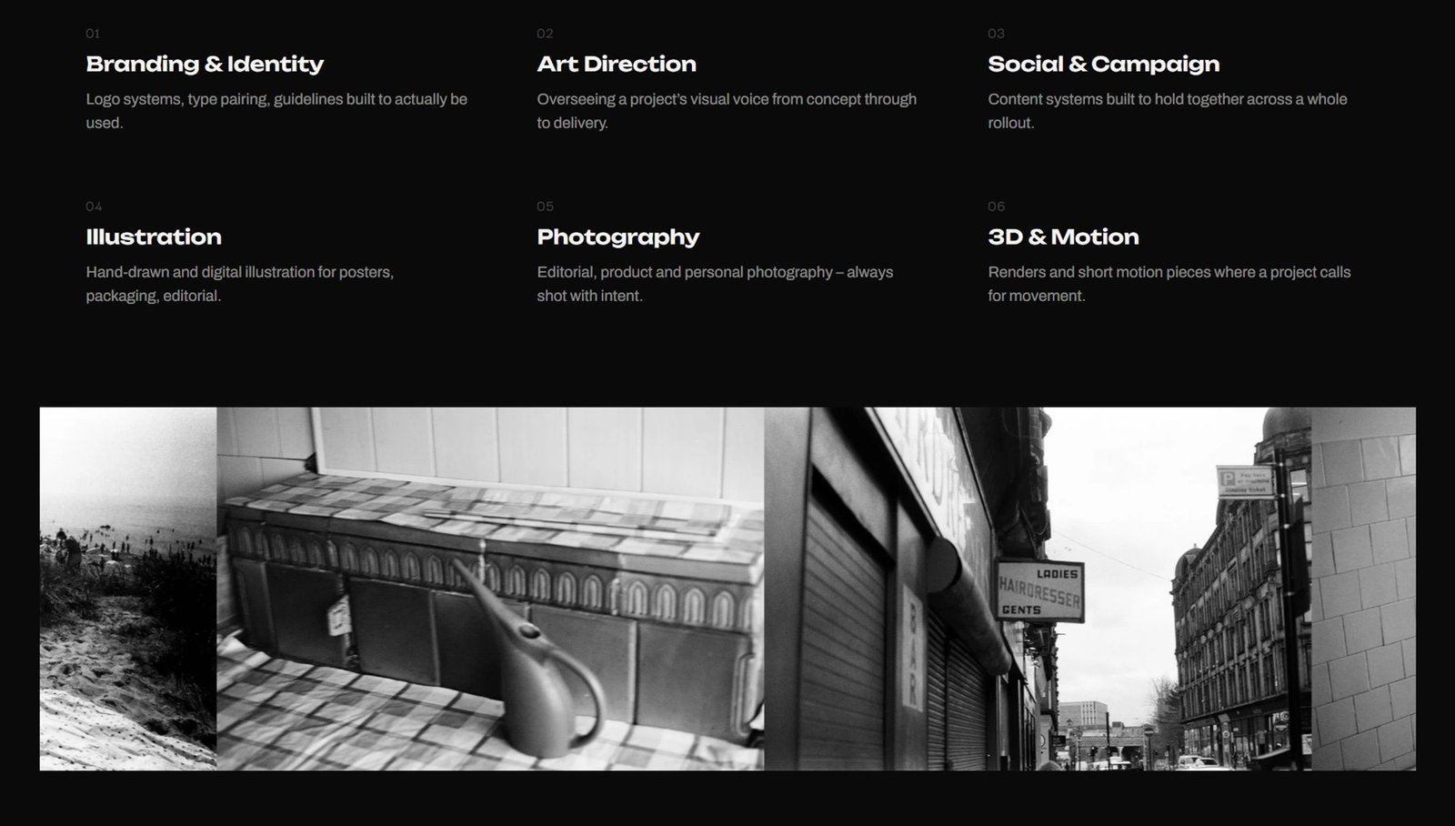
The About page returns to the dark background and ties back to the homepage. On the left, a large experience figure with a list of disciplines; on the right, text about approach, education and an award – the number catches the eye, the text gives context to those who want it. Below, a numbered grid of six competencies, each with a single sentence, and a full-width strip of personal photography.
Three lines.
No form
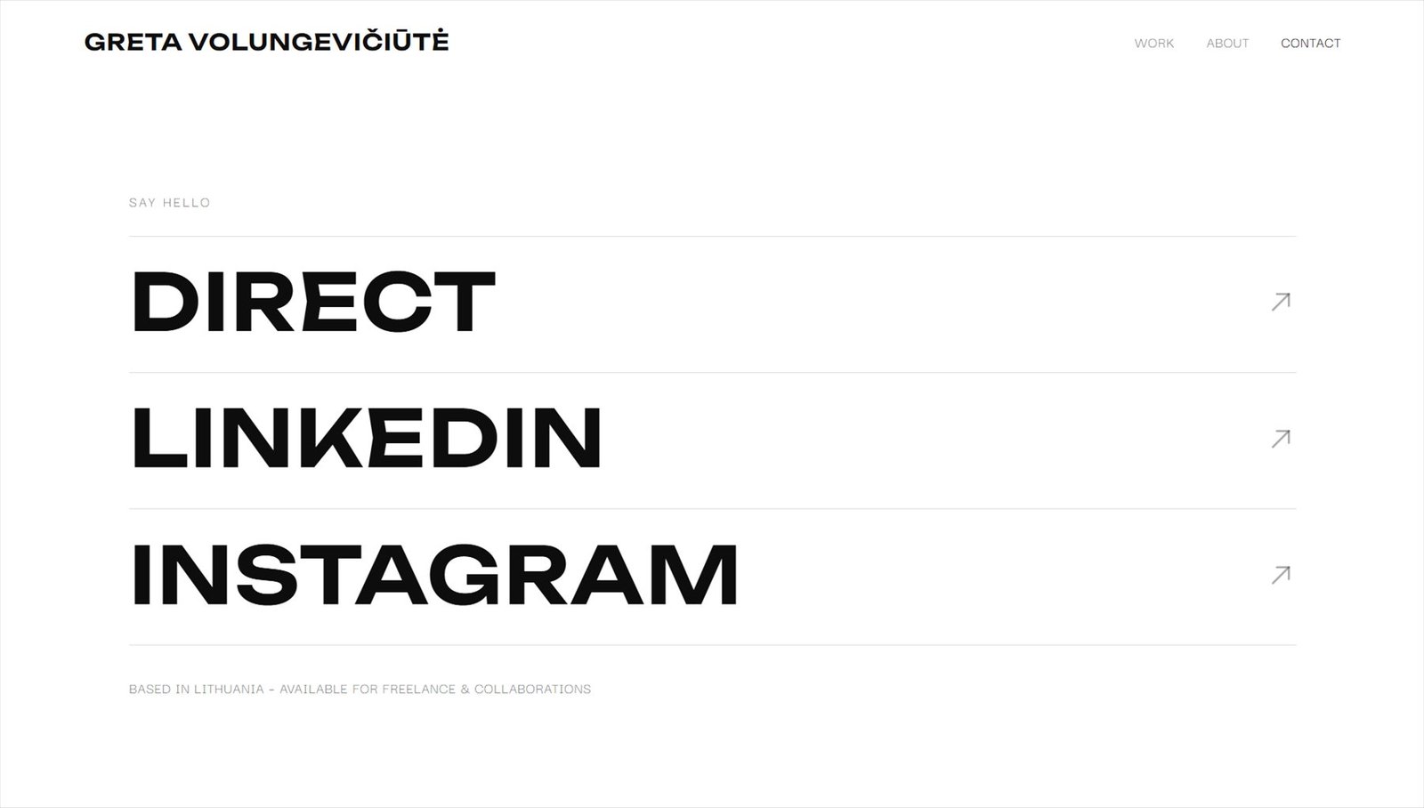
Contact is reduced to three lines: direct contact, LinkedIn and Instagram. Each one is full-width display type that behaves like a button. There is no form: in a creative field contact is made through social channels, and a form only adds a step.